Aesop Kitsilano
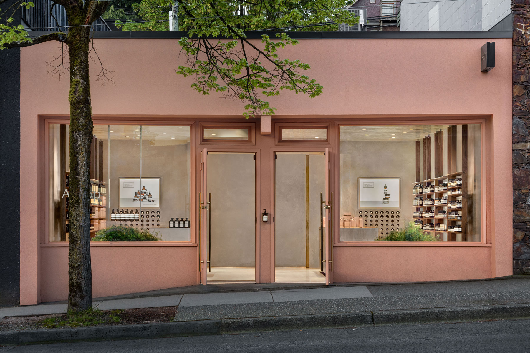
The design concept of the Aesop boutique is inspired by the geography and particular topography of Vancouver Bay and takes up the theme of contrast to propose an interior design where borders are opposed and materials respond by symmetry.
Taking its name from its Amerindian origins, Kitsilano really took off in the 50s and 60s with the hippie movement and the cultural mixes that enrich the neighborhood. Mostly residential, one finds large coloured residences, covered with light wood cladding or plaster in pastel tones, element taken up in the choice of pastel pink for the Aesop store façade.
Surrounded by powerful nature, Vancouver was built on the water’s edge, on a plateau overlooking the surrounding mountains. The development of port activity reached its peak in the 1930s thanks to the timber trade. The concept of the shop transcribes this meeting of strong geological elements in the palette of materials used as well as in the notion of clear boundary, where the raw minerality of mountains and water meet.
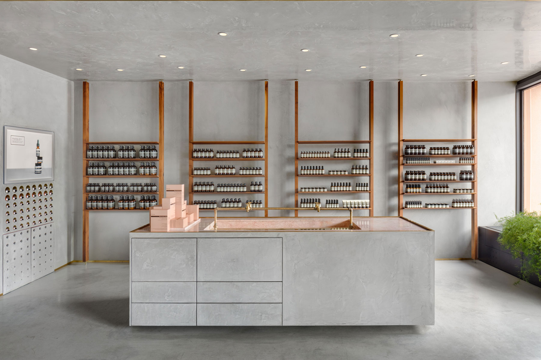
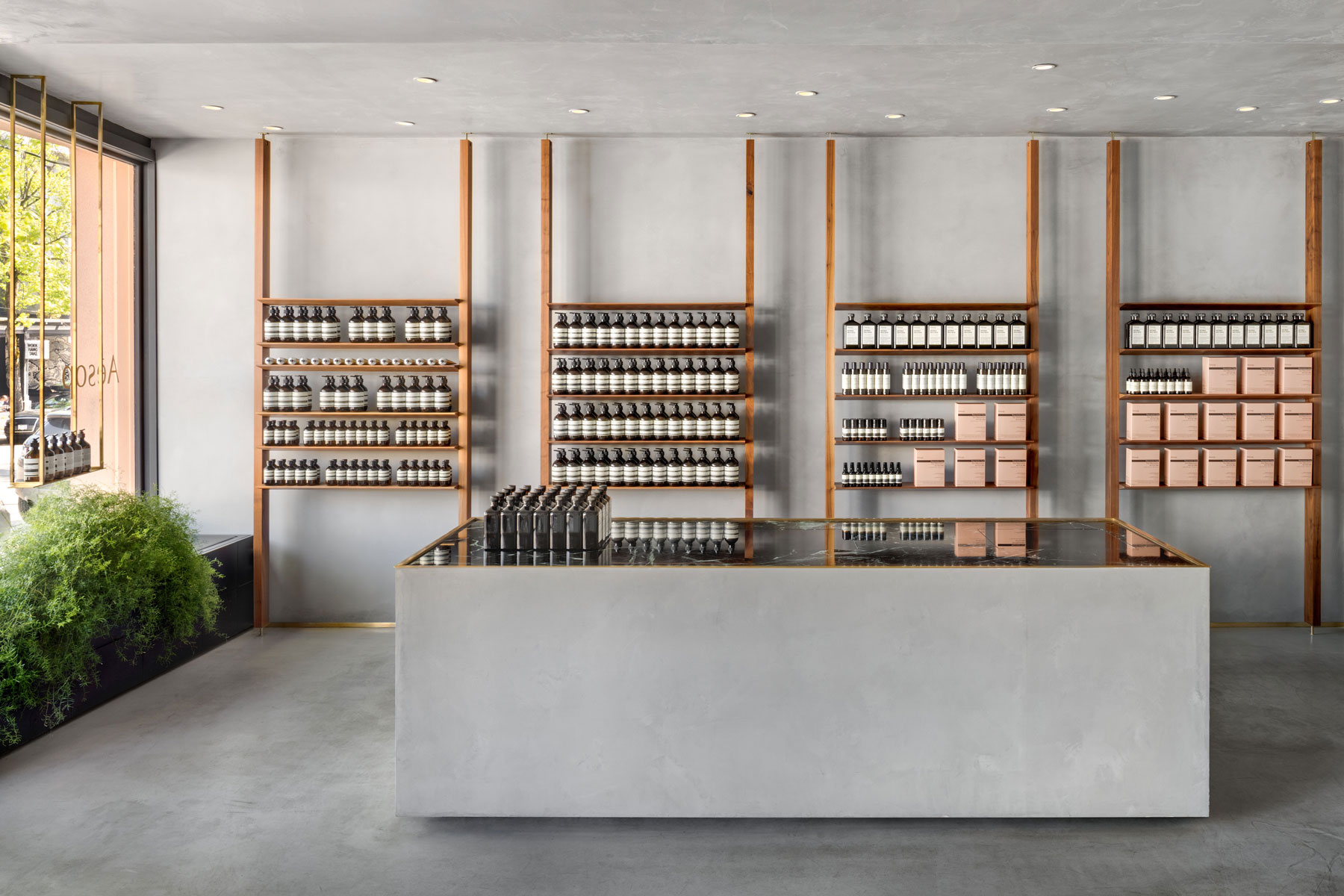
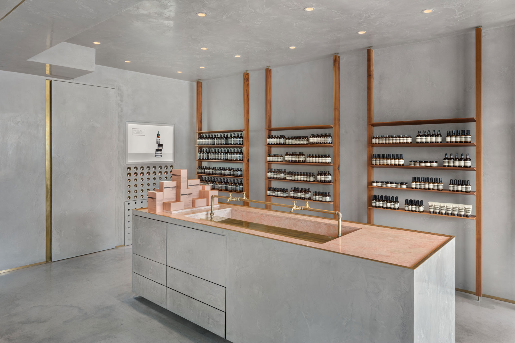
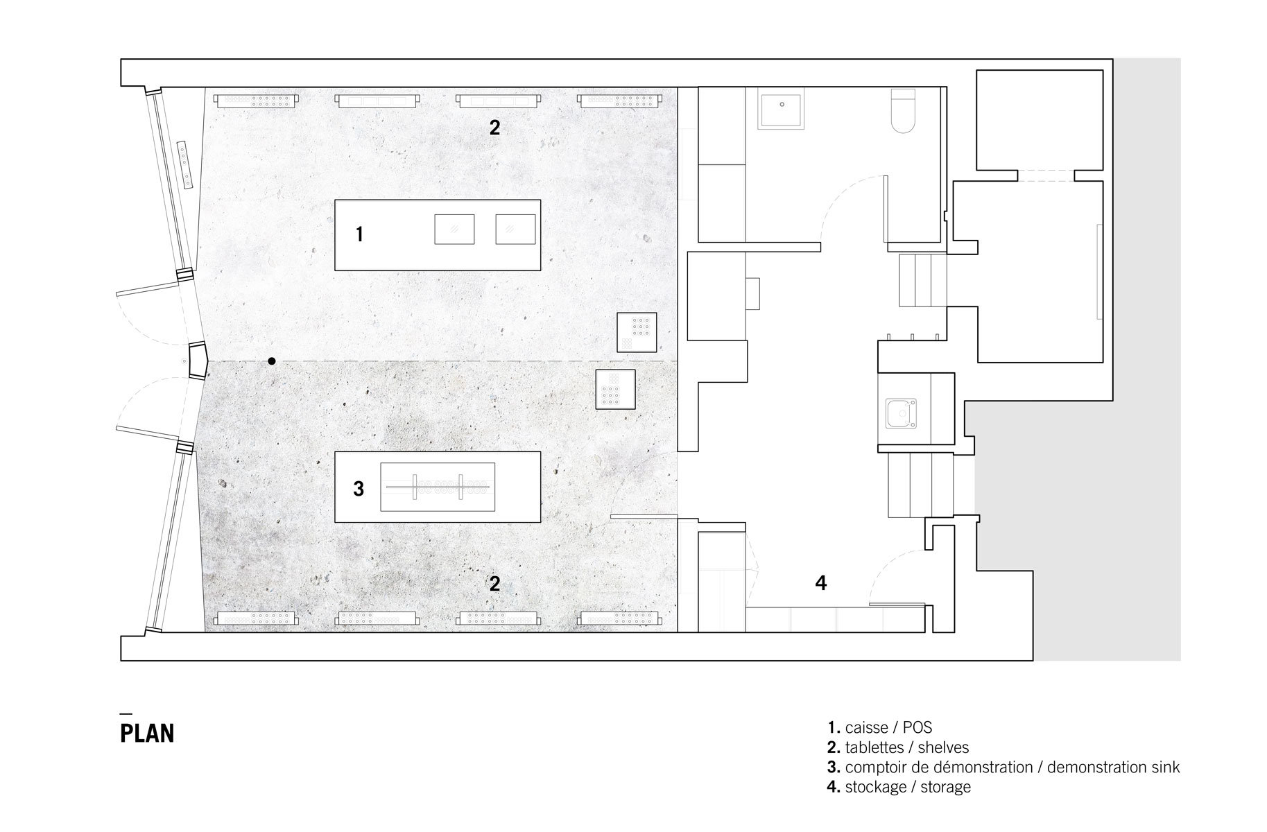
Building on the symmetry of the existing façade, the concept expresses the duality between the mountains and their mirror reflection in the Vancouver Bay water. The store is thus divided into two parts. From the floor to the ceiling, the first is covered with a matt mineral surface while its opposite, darker and brighter, seeks to express the shiny surface of the reflection. On both sides, the demonstration sink and the point of sale of the same volume are distinguished by the texture of the counters, a pink marble evoking the pastel tones of the façade and a green marble evoking an abundant plant cartography.
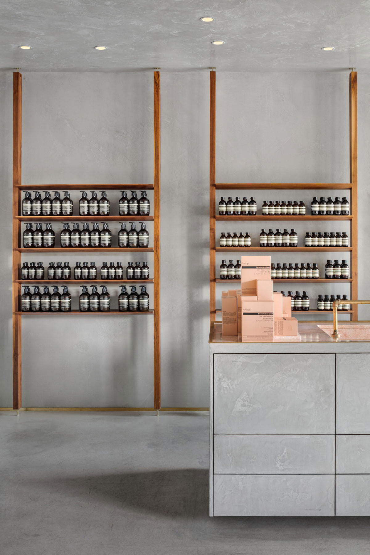
On the walls, a vertical grid of walnut wood uprights contains amber bottles placed on shelves, thus referring to the former timber trade.
Type
Boutique
Intervention
Interior Design
Location
Vancouver, BC
Photo Credit